Norton File Manager: MIA but Missed
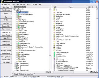
Background: More than thirteen years ago, long before Windows95, one of my favorite utilities was from Central Point Software. It was a When Symantec bought Central Point in, what, 1994?, the file manager was retained, and an updated, tweaked version was released for use with Windows95. Then it survived as one component for Symantec’s NT Tools for Windows 1.0 (also including antivirus warez). Occasionally I saw mention of version 2.0, but this never saw the light of day. Clearly Superior. What made (and makes) it superior? Two huge reasons. 1. Unparalleled Options. Thirteen years ago, Norton File Manager (NFM) had better resources for file management that Windows Explorer does today. For example, Windows Explorer offers six categories on its toolbar:
- File
- Edit
- View
- Favorites
- Tools, and
- Help.
- File
- Disk
- Edit
- View
- Tools
- Options
- Security
- Window
- Help
 (Click to enlarge, of course.)
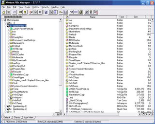
 2. Unparalleled Customizeability. Besides a still unparalleled feature set, the other awesome quality of NFM is its extreme customizeability. This means that you can create a menu on either side of the screen (or the top and bottom) and populate it with text or icons. Thus, the style in the screenshot above can be changed to the one below. The content is the same, but the style of presentation has been customized:
 (Click to enlarge, of course.)
Not only that, you can edit and rearrange the contents of these toolbars to include anything you want! And the pre-designed selection of icons is quite generous, including ones such as “Undo”, “MS DOS Prompt” and “Compare Files” which I have yet to see in Windows Explorer.
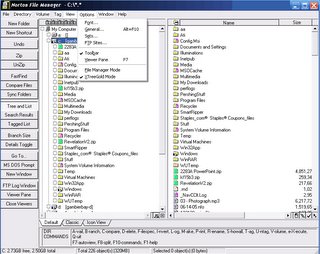
But wait, there’s more! Besides being able to extremely customize the contents and location and style of the toolbar, you can create your own toolbar items! There are generic commands and an interface for creating your own: This means you can create your own commands, and stack them in a toolbar for instant access! Here's what the easy interface for this looks like:
![]() And this was thirteen years ago! Will Windows Explorer ever be able to even approach this? This deep orientation for customizeability extends even to the style of the entire program: you have a standard view (used in these screenshots), a view resembling the ancient Windows 3.1 file manager window, an icon view, and XTreeGold mode, which looks like this:
And this was thirteen years ago! Will Windows Explorer ever be able to even approach this? This deep orientation for customizeability extends even to the style of the entire program: you have a standard view (used in these screenshots), a view resembling the ancient Windows 3.1 file manager window, an icon view, and XTreeGold mode, which looks like this:
 (Click to enlarge, of course.)
And all this was done half a generation ago, most incredibly prior to Windows95. If there were more competition in the desktop OS market, it’s likely that we would have seen vastly more capable, supple file managers than Windows Explorer. But we don’t, and all we have as the benchmark of excellence is a product which was mature before Windows95 had ever hit the market. In fact, whenever I have reviewed the file management utilities on ZDnet, I have yet to find anything nearly as capable. Look hard for copies; of course it has been long since discontinued.
Look at my screenshots, ye mighty, and despair.


0 Comments:
Post a Comment
<< Home